Permian
Originating a visual identity for a modern sneaker brand

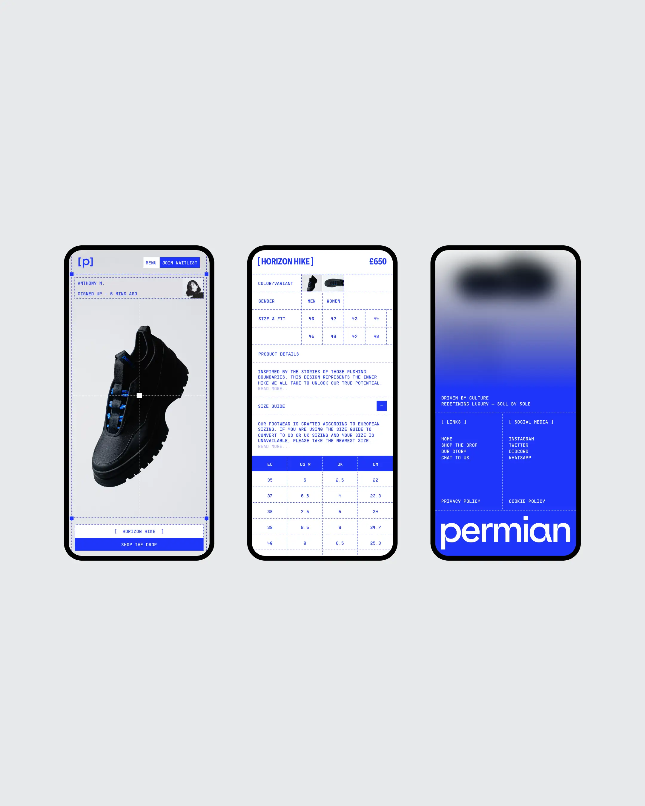
Permian is a digital fashion brand shaped by its community and built on web3 foundations. Our task was to design a visual identity that could hold this duality, to create something grounded in history but made for the future.
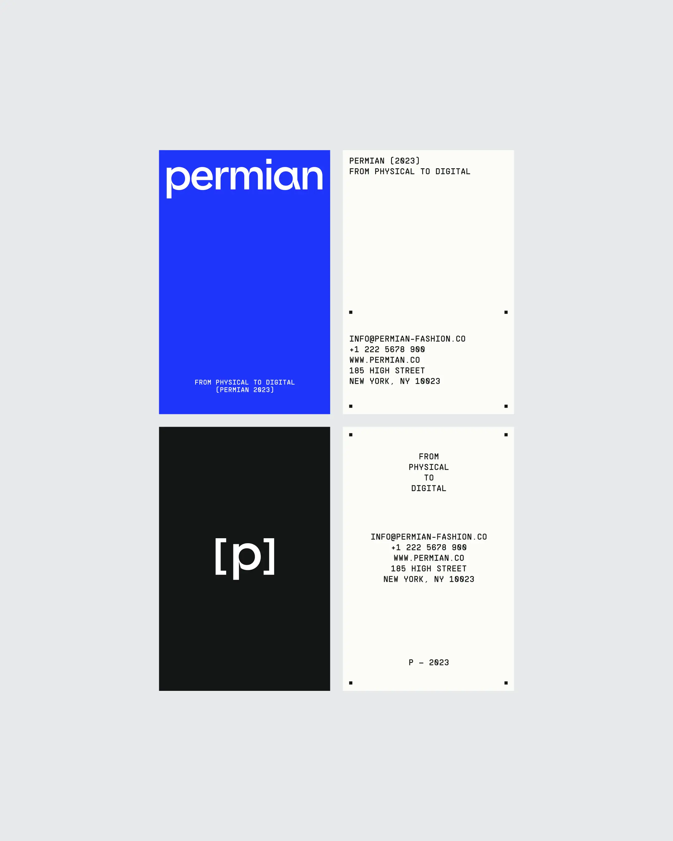
The brand takes its name from the Paleozoic era, a reference that inspired a visual direction rooted in ancient influence and modern culture. The primary brand color, a rich, deep blue, reflects that balance. It’s timeless and grounded, yet carries a contemporary edge that aligns with Permian’s presence in digital fashion.
The brand’s typography played a key role in defining the tone of voice. We paired a bold, industrial sans serif with a digital-forward monospace, creating a tension between heritage and innovation. It’s a combination that speaks to both the brand’s urban London roots and its digital-first approach.
To build out the system further, we created a set of supporting visual elements: dotted lines and square motifs. The dotted line references both stitching in physical fashion and the continuity of time, while the square acts as a visual anchor, placing community at the center of the brand.
Together, these elements form a cohesive identity that’s both considered and expressive. Permian’s new brand captures its vision: a future-focused platform shaped by its past and driven by its people.
Industry
Fashion
Team
Lazar Glumac
Philipp Thelen
Sofija Stojinoviċ
Vito Balen
What we did
Creative Direction
Visual Identity
Website Design
Website Development
eCommerce
Awards
Awwwards — Site of the Day
Awwwards — Developer Award